Colour in any home is more important than you might first realise. Whilst most of us naturally opt for paler colours in bathrooms and avoid going too bright in a calm living room space, there's a science behind the colour choices we make. Read on to see which colours you should go for the next time you redecorate.
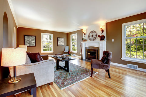
1. Looking for sophistication and warmth? Go for darker colours.
Darker tones give large rooms a more intimate appearance, which can feel a lot more inviting than something too bright that has the danger of appearing clinical.
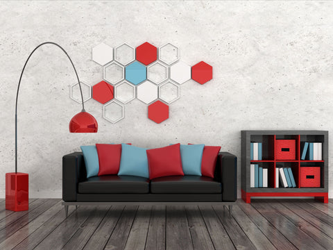
2. Red is great for adding intensity.
Painting a room red is a surefire way to get people energised. Perfect for stirring up excitement in the living or dining room, red draws people together and stimulates conversation. In an entryway, it creates a strong first impression and a dark red can be a great choice for any room that you'd like to look rich and elegant.

3. Avoid yellow for your main colour schemes.
Whilst pops of yellow in small spaces like bathrooms or hallways can add an uplifting energy to a room, psychological studies have revealed that people tend to lose their tempers more when surrounded by yellow. It’s also advisable to avoid yellow when painting your baby’s room. Whilst cheerful and warm, it actually has been shown to make babies more prone to crying! Not ideal for those first few months.
4. Blue for bathrooms and bedrooms.
Known for lowering blood pressure and slowing heart rates, blue is a great calming colour for the home in relaxing rooms. Warm blues in family rooms tend to work best, allowing you to leave the cooler tones for the bathrooms and smaller spaces. And for those of you on a diet and about to do up your kitchen, note that blue is supposed to suppress appetite, whereas yellow increases it. Definitely worth knowing before you crack out those paint tins!

5. Green is the most restful colour for the eye.
Like the calming effect of blue, green has been shown to suit almost every room in the house as it strikes a great balance between being calm but also warm, mimicking the natural world around us. Although quite hard to pull of in large quantities, green accents and contrasts with other colours make it an excellent choice for the home.
6. Craving excitement? Go orange!
Orange is supposedly the best colour for concentration and productivity, making it a good choice for exercise rooms and places like the kitchen where you'll see lots of activity. Energising and bright, orange is also shown to boost your mood, making it a strong option all round.